
An engineer's guide to vibe design (with prompts)
Engineers move fast. Your design should too.

Design used to be a dependency. If the Figma wasn't ready, neither were you.
Enter vibe designing.
With tools like Lovable, v0.dev, and Bolt, you can ship polished apps without waiting on anyone else.
This post shows the full process – start to finish – by actually designing a tiny app while we go. No designer in the loop, just vibes, taste, and a few rounds with an LLM.
Step 1) Define your job to done
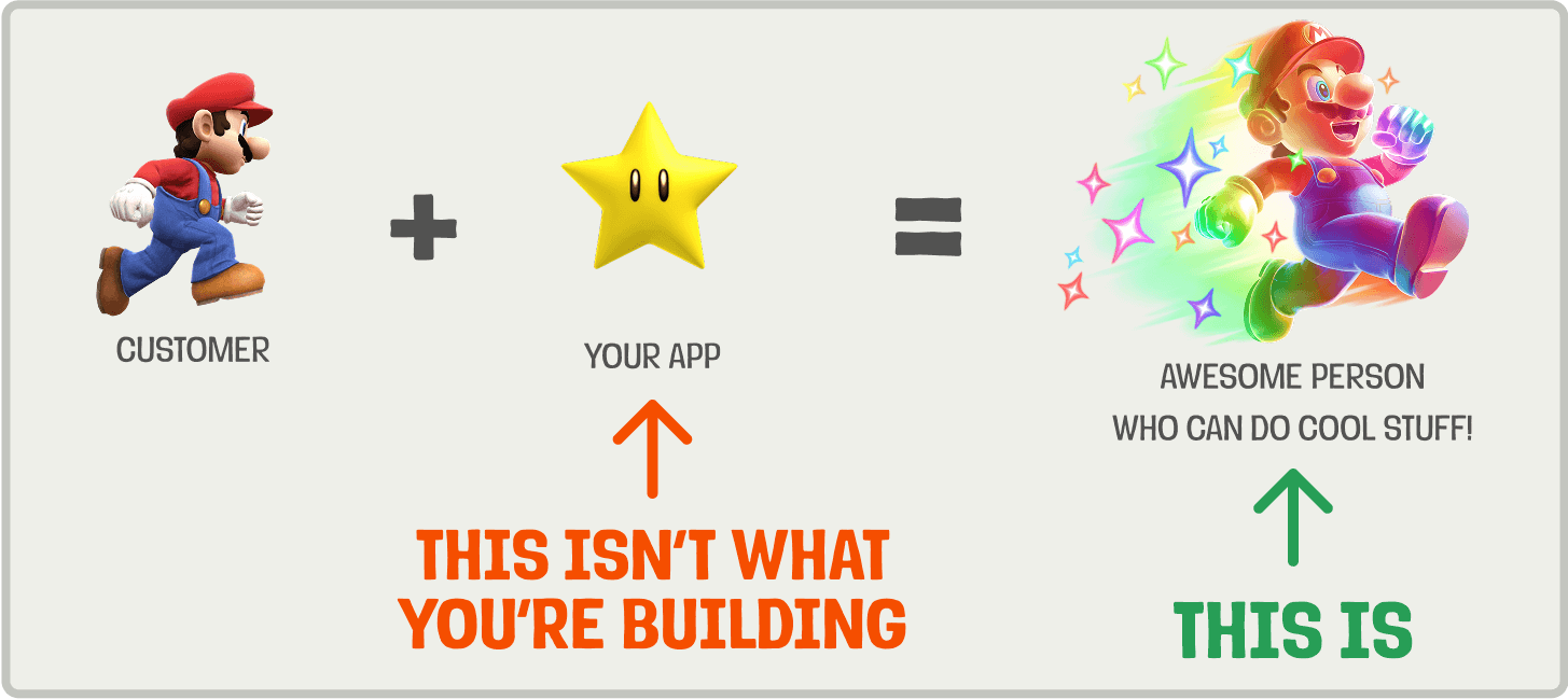
People don't care about your product. They care about getting their job done.
Your first step is to define that job in a single sentence. This isn't just a nice-to-have, it's your design compass. It makes priorities obvious and tradeoffs easier to navigate.
A good statement is anchored in real user context and focuses on their desired outcome. A practical way to define it is:
When [trigger] happens, [user persona] wants to [action], so that they can [desired outcome].
Here are some examples:
Example 1: Incident management tool (e.g. incident.io)
❌ "Engineers need to send incident updates."
✅ "When an incident occurs, engineers want to communicate status updates quickly and clearly, so that customers and internal stakeholders stay informed and trust is maintained."
Example 2: Team wiki product (e.g. Notion)
❌ "Employees want a company handbook."
✅ "When an employee has a question, they want to find the relevant answer quickly, so that they can stay productive without asking someone."
Example 3: Issue tracker (e.g. Linear)
❌ "Developers want to track bugs."
✅ "When a developer hits an error, they want to log a bug quickly and hand it off, so that they can get back into their flow."
For the rest of this post, we'll use the issue tracker example and create a tiny bug tracker called BugSplat 🐞💥
Step 2) Steal like a product engineer
With your job to be done in mind, steal inspiration from existing products by playing with them. Pay attention to how they look and feel. A few things to think about:
First impressions: Where do your eyes go first?
Flow: How many steps or clicks to achieve the job?
Feel: Calm? Overwhelming? Playful?
Micro‑interactions: Subtle animations, hover/focus states, error/success cues.
Performance: Perceived speed, load times, skeletons while fetching.
Take screenshots and scribble notes. You now have a taste bar for yourself and references you can share with an AI.
In the case of BugSplat, here's what I found when I researched similar apps:

Step 3) Wireframe with an LLM

You should now have a strong opinion of how you want your app to look and feel. The next step is to wireframe it and see how the UX holds together.
Lovable, v0.dev, or Bolt can get you to a working wireframe fast. The key is to give them enough context on what the app should do, who it’s for, and how it should feel. Don’t forget to include your notes and screenshots from your competitor research.
Here's the template I use:
# Goal
You're helping me design a wireframe for an app/feature that <your single sentence on your job to be done>.

## Target user
<Who is this feature for, and what mindset are they in when using it?>

## Success criteria
<How you will know your user has achieved their job to be done>

## Key screens
- <screen 1>
- <screen 2>

## Requirements
- <What your app *must* do>
- <What your app *must not* do>

## Design intent
The UI should feel: <clean, fast, minimal, playful, etc.>
Prioritize: <clarity, speed, minimal steps, mobile-first, etc.>

## Tech stack
<Your preferred tech stack, component libraries, etc.>

## Inspiration from competitors

### <Competitor Name>
**What works well:**
- <list of patterns or layouts you like>

**What doesn't:**
- <list of things to avoid>

**Competitor screenshots**
- <description of first competitor screenshot>
- <description of second competitor screenshot>
Keep prompting until the wireframe feels right. Here's the full prompt I used for BugSplat:
# Goal
You're helping me design a wireframe for an web app that lets users log a bug and assign it to a teammate in under 30 seconds.

## Target user
A software engineer or product tester reporting a bug mid-flow. They're in a rush and need to get the issue logged and handed off with minimal friction.

## Success criteria
The user can:
- Open the app
- Enter a bug title and description
- Assign it to a teammate
- Save it

All of this must be done within 30 seconds and 3–4 clicks.

## Key screens
- Bug list (default view, sorted by status)
- New bug form
- Single bug detail view

## Requirements
- Must support: bug title, description, status (open/in progress/done), assignee
- Must support: fast reassignment and status updates
- Must not require account switching, complex onboarding, or configuration before logging
- Should be desktop-first

## Design intent
The UI should feel: fast, minimal, focused
Prioritize: speed, clarity, zero-fat UX

## Tech stack
- Next.js
- Tailwind
- Shadcn

## Inspiration from competitors
### Linear
**What works well:**
- Clean, minimal layout
- Fast modal-based bug creation
- Keyboard shortcuts for power users

**What doesn't:**
- Abstract language
- Intimidating for non-technical users

## Jira
**What works well:**
- Customizable workflows

**What doesn't**
- Overly complex
- Too many clicks and screens
- Slow performance

### GitHub Issues
**What works well:**
- Familiar issue structure
- Good activity history

**What doesn't:**
- Too many fields upfront
- Slow to create quick entries

**Competitor screenshots**
- linear_bug_list.png - shows simple bug creation
- jira.png - shows cluttered UI
- github_issue_form - show too many fields in bug creation
And the wireframe is generated:

Step 4) Bring it to life
Once you're happy with the wireframes, the next step is to make it look and feel like a real product. How you approach this depends on whether you're adding a feature to an existing app, or building something completely new.
a) Slotting into an existing app:
Prompt the LLM that has your wireframe to flesh out the UI with your app's design system. The more context you provide, the closer the output will match your actual product. Useful inputs include:
UI components for core interaction patterns
e.g.components/ui/button,input,cardLayout primitives to show how you handle spacing and structure
e.g.layout/container,gridDesign tokens for colors, typography, and spacing
e.g.tailwind.config.js,theme.jsPage layouts to demonstrate full-page structure and composition
e.g.layouts/app-layout,dashboard-layoutReal screens to show how everything comes together in context
e.g.pages/settings,user-profile
Here's a prompt you can use:
The wireframe looks great. Now translate it into production-ready UI that blends seamlessly with our existing app.

### Attachments
- tailwind.config.js – design tokens
- components/ui/* – buttons, inputs, cards
- layout/* – containers, grids
- layouts/* – page shells
- pages/settings.tsx, user-profile.tsx – density, tone, & copy reference

### Constraints
- Re-use existing components where possible
- No new colors, fonts, or spacing values outside `tailwind.config.js`.
- No inline styles; stick to Tailwind utility classes already in the codebase.
b) Building a brand new app
With no legacy design language, you need to create enough scaffolding to keep the LLM from wandering into neon gradients and Comic Sans.
To start, generate your app's core color palette. I like using Coolors or Figma's palette generator for this. If you're stuck on deciding on a color palette, draw inspiration from your favorite apps.
Once you have 4-6 foundational colors, use an LLM to map them to key roles in your UI (e.g., buttons, text, backgrounds, and so on). Here's a prompt to do that for you:
# SYSTEM
You are a senior design-system engineer whose job is to turn a raw color palette into a set of design-token "color roles" for a multiplatform app.
- Always meet WCAG 2.2 contrast (AA for body text, AAA for error text, 3 : 1 for icons ≥ 24 px).
- Never invent new hues outside the supplied palette unless asked. When tints/shades are needed, adjust L* in OKLCH (or HSL if OKLCH unavailable) while keeping hue & chroma stable.
- Output pure JSON, no comments, no Markdown.

# USER
Here is the brand palette you must work with (**coreColors**).
Generate the token set described under **tokenSpec** and return exactly the JSON structure shown under **schema**.

coreColors <Replace with your own>:
  seashell:        #EEE2DF
  champagnePink:   #EED7C5
  rosyBrown:       #C89F9C
  burntSienna:     #C97C5D
  redwood:         #B36A5E

preferences <optional>:
  My preferences are for <color_name> to be used as the background color, <color_name_2> to be used for the buttons, <color_name_3> for text, etc.

tokenSpec:
  # Neutrals & text
  - background
  - textPrimary
  - textSecondary

  # Brand / accent
  - accent
  - accentPressed

  # Secondary actions
  - buttonSecondary
  - buttonSecondaryPressed
  - onButtonSecondary

  # Interaction states
  - focusRing
  - border
  - disabledControl
  - onDisabled

  # Links
  - link

  # System feedback
  - error

schema:
{
  "roleName": {
    "hex": "<hex>",
    "contrastTarget": "<role it must be readable against>"
  },
  ...
}

# INSTRUCTIONS
1. Map each role in **tokenSpec** to a hex from **coreSwatches** or a tint/shade derived from it.
2. Ensure every `text` and `link` role meets at least **AA** contrast on its intended background (`background` for text, `buttonSecondary` for `onButtonSecondary`, etc.).
3. `error` must meet **AAA** contrast on `background`.
4. `accentPressed` and `buttonSecondaryPressed` should be ±6–12 % lighter/darker than their base roles.
5. `focusRing` must meet ≥ 3 : 1 contrast against whatever element it appears on.
6. Validate all contrast requirements and return **only** the JSON matching **schema**—no extra keys or explanatory text.
Next, take your generated color JSON and feed it back to Lovable/v0/Bolt along with the prompt below. You’re giving it the building blocks (colors, typography, spacing, shadow, etc.) to generate a cohesive design system. You'll probably need to prompt it further to tweak the output to your liking.
The wireframe looks great. Now translate it into production-ready UI using the following design system:

**Typography:**
< How should the font feel and function? Pick one: >

- Clean and modern with clear hierarchy (e.g. Inter, SF Pro, Helvetica Neue)
- Friendly and warm with rounded edges (e.g. Nunito, Poppins, Quicksand)
- Tech-forward and utilitarian (e.g. Roboto, IBM Plex Sans, JetBrains Mono)
- Editorial and expressive (e.g. Georgia, Playfair, DM Serif)
- Highly legible for small UIs (e.g. Source Sans, Lato)

### Spacing scale
< How sharp or soft should components feel? Pick one: >

- Tight spacing (good for for dense UIs like tables, admin panels)
- Loose spacing (good for calm UIs)
- Standard/neutral

### Elevation / Shadows
< How sharp or soft should components feel? Pick one: >

- Minimal shadows, soft elevation (e.g. `shadow-sm`, light Material)
- Medium elevation with defined depth cues (e.g. hover cards, dialogs)
- Strong shadows for drama and hierarchy (e.g. dashboards, modals)
- No shadows – use outlines, contrast, or borders only
- Glassmorphism (blur + subtle shadows for futuristic feel)

### Borders & Radius
< How sharp or soft should components feel? Pick one: >

- Soft and approachable (rounded-xl, 12–16px)
- Lightly rounded (rounded-md, ~6px) for subtle friendliness
- Sharp and modern (0–2px radius)
- Card-like with border + radius + light shadow
- Neobrutalist: hard edges, visible outlines, minimal styling

### Sizing
< What's the ideal scale for your components and layout? Pick one: >

- Touch-friendly (44px+ targets, comfortable paddings)
- Compact (tight controls, for expert users and data-dense screens)
- Big type and buttons (for mobile-first or accessibility-first design)

### Colors
<The outputted json from your color palette prompt>
I opted to create a modern and minimalist dark mode feel for BugSplat. Here's what it looked like after creating and applying my design system:

Step 5) Final polish 💅🏼
You should now be 90% of the way there. The final 10% is polish.
Great design isn't magic. It's a set of rules you can learn. And applying them correctly means you don't need to guess what looks good.
Here are six foundational principles every engineer should know. Your UI should pass each one.

Applying the rules to BugSplat, I noticed a few things:
Hierarchy:
❌ The "Bug Tracker" headline is large, but not actually important. Should be smaller.
❌ The ticket's last updated time is more important than the description, so it should appear above it.
❌ The filter button text is too small.
Contrast:
❌ The filter button background is the same as the tickets, making it hard to notice.
❌ The purple text which shows the total number of open tickets is hard to read.
Balance:
❌ The tickets currently skew components heavily to the left.
Consistency
❌ The number of open tickets component looks like a button but isn't.
❌ The new bug and filter buttons have different heights.
Alignment
❌ The white circles on the tickets representing the user’s profile pictures are not left-aligned, making it look awkward.
Proximity:
✅ Everything looks good
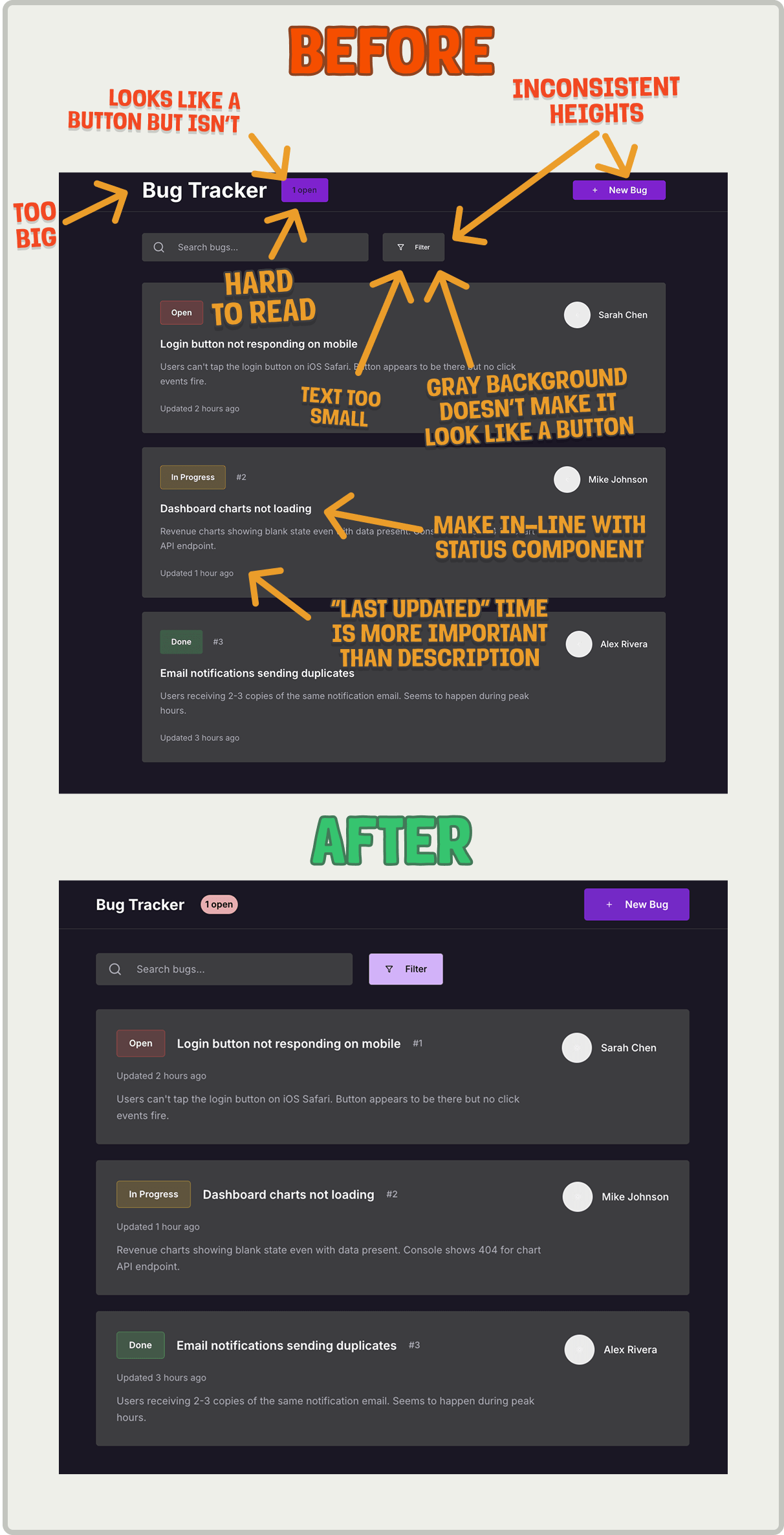
Ah, much better. Which brings us to the final step.
Step 6) Ship it and iterate
Once your UI is in decent shape, get it in front of real users as soon as possible. You'll learn more from watching someone use it than from any internal review.
Here's how to ship safely and learn fast:
Use a feature flag to launch to a small group of trusted users first. It lowers the stakes and buys you space to improve.
Watch session replays to spot where people hesitate, rage click, or bounce.
Use product analytics to track key funnels, so you know if users are actually completing the job to be done and not just poking around.
Talk to real humans. Ask what felt slow, confusing, or unnecessary. You'll be surprised what they struggle with.
Iterate quickly. One small fix at a time adds up fast.
TL;DR
You can be a designer too. The process is learnable and can get you shipping in hours instead of weeks.

Words by Lior Neu-ner, whose design experience includes MS Paint.
😎 Vibe-driven development reads:
Laws of UX – Jon Yablonski
Family Values – Benji Taylor
User Interface Design For Programmers – Joel Spolsky
This is gold! I have been struggling to get the desired result on lovable. I'll go ahead and try this.
When "Slotting into an existing app", do you provide the LLM (V0, Lovable) with your own code for each one of the listed input examples?
From my experience of porting UIs form V0 to existing codebase, what works best for me is the following workflow (Using Claude 4):
1. Split the view in V0 into smaller parts: header, first row, left column, right column
2. Pick one part and copy generated component code only for that part from V0 over to Cursor. Provide it inline as context, ideally with a screenshot of what it looks like in V0.
3. Describe that I want "the looks" from V0 yet I want the LLM to integrate using components and logic which exists in the codebase (input validations, some styles etc.)
4. Ensure that everything is clear to the model by adding "Before you start coding, ask me questions to clear any ambiguities with me first."
5. Clear any ambiguities, plus provide extra context if anything comes to mind.
6. Let it code it up.
7. Test, provide feedback. I typically re-added the screenshot at this stage.
8. Start over by creating a new conversation and work on the next part of the UI from V0.