

Good taste makes great products
Simple design principles every engineer should know

When we talk about how to be a good product engineer, we often focus on how you need to ship fast, be customer obsessed, and take extreme ownership of ideas.
But one important quality is subjective: taste.
Taste means intuition for what makes a product feel great to use, and knowing how to evoke those feelings in your own work.
It’s these emotions that earn loyalty and convince others to share what you build.
No one is born with good taste. It’s something we cultivate over time through exposure to good (and bad) things.
In other words, taste is a muscle you can train.
1. Understand and embrace affordances
An affordance is the way an object communicates how it works. In The Design of Everyday Things, Don Norman provides the example of a door handle.
Doors you pull should have a nice handle for gripping and yanking, while doors you push should have a broad surface that shouts “you need to shove this.”

The “crash bar” on these doors affords only one interaction: you must press it, with a hand or even your hip. Unambiguous.
But some doors ignore all conventions, and they are infuriating. They fight intuition and resist progress.
Unlike doors, which are bound by physics, software design affordances are more cultural. We invent them, and sometimes they stick. The more you’re exposed to different software, the more you’ll develop awareness about how it communicates.
If you can’t find exactly the affordance you need, it can help to look to the past.

Since the 1980s, computer users have known that dialog boxes often have a default button. The button will have extra visual emphasis, and pressing return is the same as clicking on it. You’d recognize this in any operating system.
Radio buttons and checkboxes are another timeless example.

When we see the circular bullets of the radio button, we know that we can choose only one of the presented options.
Whereas the checkbox tells us multiple selections are valid.

We understand these affordances at a glance.
We can validate our assumptions by playing with the controls, but their shapes telegraph their function before we interact, saving us time.
Here are a few more you still see today:
Buttons – clickable regions – have outlines and often distinct colors
Text fields have borders and sometimes inner shadows, along with placeholder text to provide examples of what you should enter
A pop-up menu often sports a small triangle, pointed downward, to suggest that clicking it will reveal additional options
You need to play with lots of software to stay abreast of affordances – it’s vital for learning the design vocabulary users will expect and recognize.
Make a list of all the affordances you observe in software you use frequently. Do the same for products that are similar to what you’re building and look for patterns.
The more you do this, the more you’ll instinctively build them into your work, thus making your software feel effortless and familiar.
Recommended reading: Design is Storytelling by Ellen Upton is a fun treatise on the power of narrative to help software communicate with users.
2. Detect and eliminate obvious jank
You don’t need to be the most talented designer on earth to have taste.
Instead, you need a reliable sense of what is janky and what is nice, and the ability to nudge a product in the nicer direction.
People who encounter janky software treat it with suspicion, and eventually disdain. They lose trust in the people building it, and won’t recommend it.
In contrast, pleasant software suggests care and attention, and earns loyalty. Beneath the surface, it is assumed, yet more care is lurking. Decently designed products feel more trustworthy.
You can spend a lifetime learning design, but you can learn how to spot jankiness right now.
Make friends with the grid
Grids make things look tidy and deliberate. If something feels vaguely janky, it might be because visual elements aren’t lining up according to any rules.

Scattered elements laying everywhere are janky. Even aligning things by their leading or trailing edges can get you pretty far out of jank debt.
Be disciplined in your typography
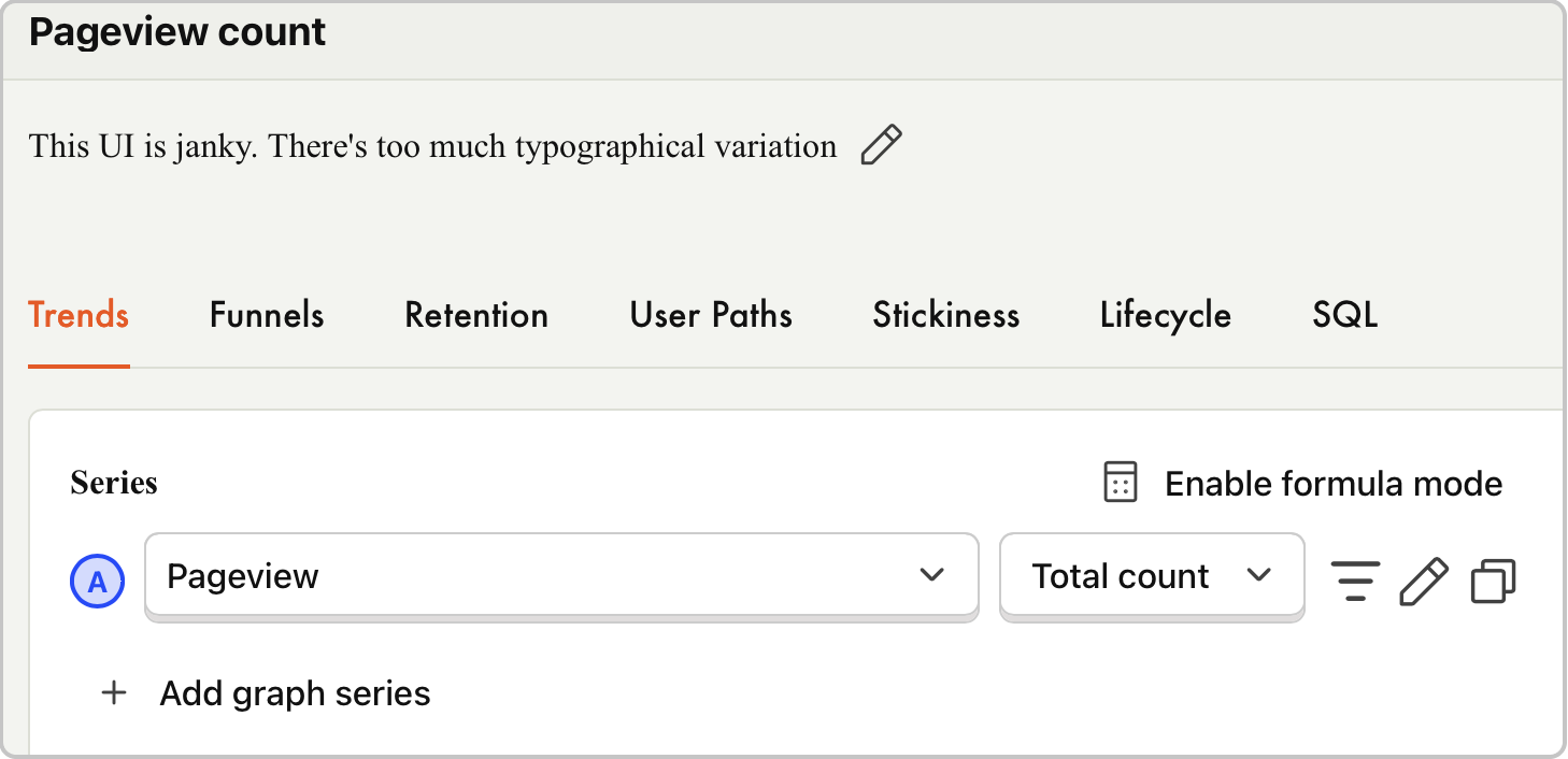
Instead of going wild with multiple typefaces, try using a single typeface with variations in weight to draw the eye towards what’s most important. This creates hierarchy, making your interface easier to scan.

Recommended reading: Typography is a huge subject, but here’s a great start on the basics from the Interaction Design Foundation. Typography in ten minutes from Practical Typography is an excellent read, too.
Mind your hierarchy
Speaking of hierarchy, where we position things communicates their importance. If something is essential for your users to see or interact with, don’t bury it.
In Stellaris, a strategy game about space exploration and expansion, resources like energy production, minerals, and food are central to every decision, so the UI places them at the top of the screen, visible at all times.
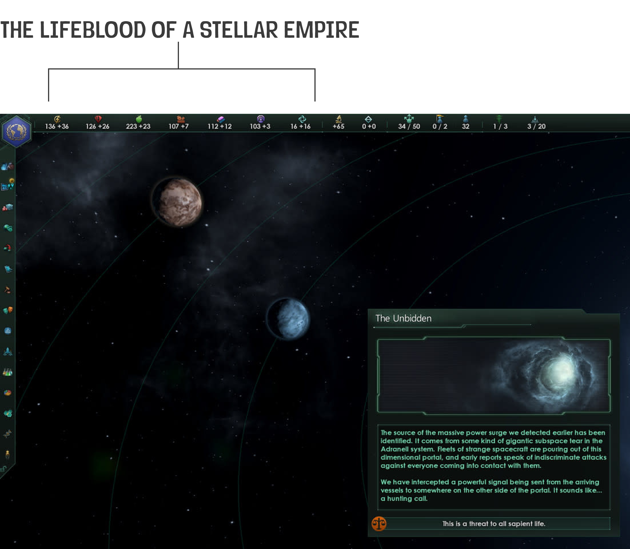
For desktop layouts, establishing hierarchy can mean placing elements at the top of the screen like this. For mobile, fixed elements at the top or bottom of the screen are easy to see and reach.
Just don’t gobble up too much real estate with an immovable element. No one wants to work in a tiny viewport.
It can be hard to attach meaning to colors
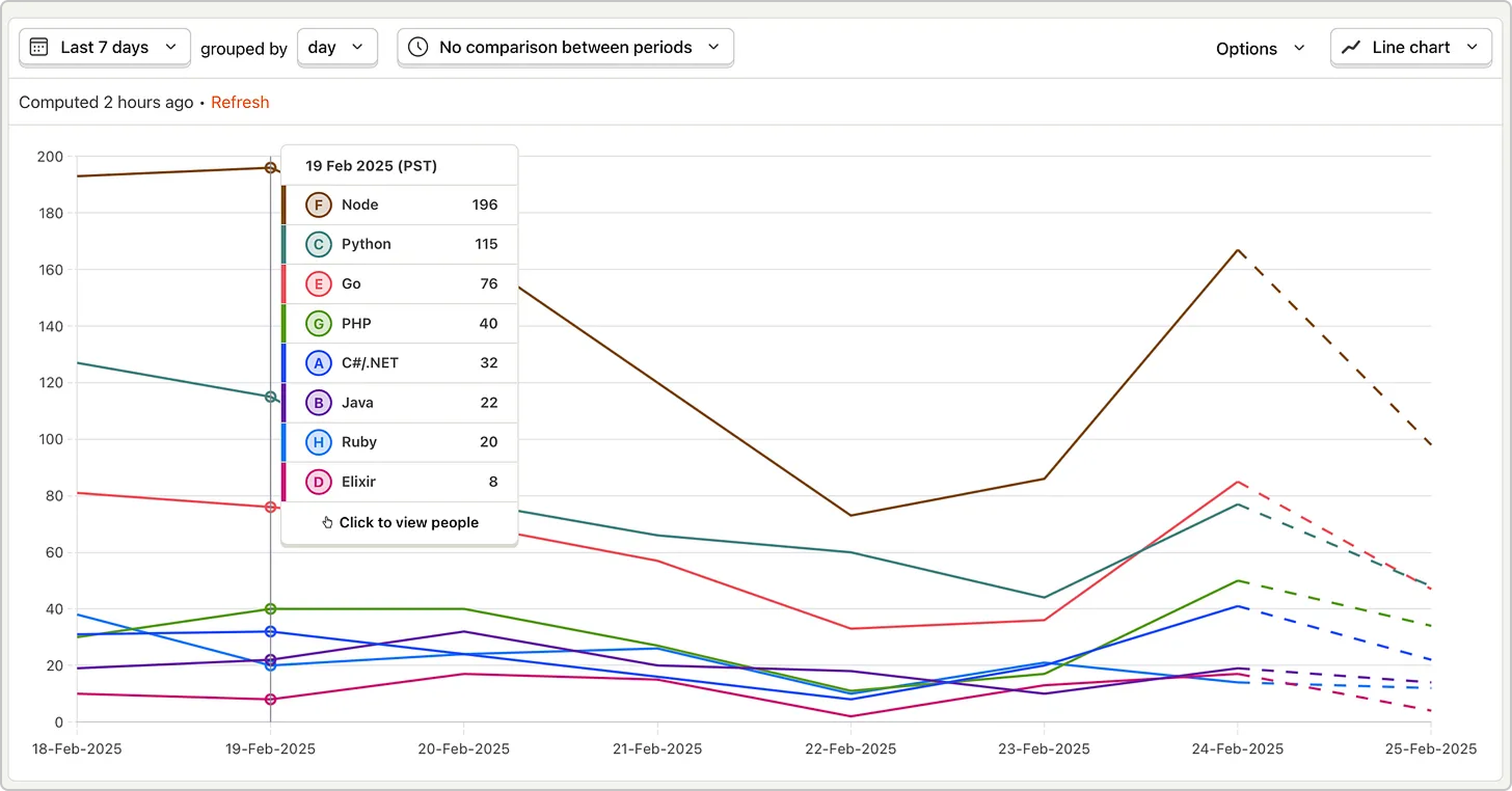
Be careful with colors: they are great as accents, useful for grabbing attention and placing emphasis. But using too many colors gets visually noisy.
Don’t assume your user will grasp particular meanings of colors, either. It’s best to provide labels or legends when you need to use several, if those colors have distinct meanings, as in a chart or graph.
Red can be a good indicator for declining values and destructive actions, but did you know that in some cultures, red can be a color for gains rather than losses? 📈
Maintain consistency
Visual consistency can reduce the burden of understanding an interface.
Take regular inventories of the elements in your product, checking them for consistency. I’ve grabbed screenshots of every button and printed them out, confronting all at once the inevitable variation that creeps into a product.
It’s okay to have some variation in your product – a button overlaid on a photo really should look different than a call to action – but too much variation just looks sloppy.
Tighten up your consistency by reusing the same styles as appropriate.
3. Validate big swings with cheap prototypes
Why? Because once you’ve built software that even sort of works, it has inertia. It becomes resistant to change, which means jankiness can fossilize.
Prototypes are code you have no intention of shipping, corners gleefully cut, dedicated just to proving whether an idea works well.
They don’t even need to be code.
Months before the iPad launched in 2010, the OmniGroup built a prototype iPad app with nothing but pen, paper, and a 3D-printed iPad model.


Prototypes are great because they pull ideas out of your head, so people can use them, and their feedback helps you make better decisions sooner.
This approach got a finance app I worked on into the market a whole year earlier.
Banking is a highly-regulated space, so there was a lot of red tape. Had we waited until everything was fully baked to get user feedback, we’d have spent 18 months building the wrong thing.
Instead, in about a week, I built a fully-interactive prototype of the product that we could immediately show in user research sessions. The insights we gained showed we could succeed by skipping the regulated bits altogether.
We were in the App Store within six months.
This approach is so important that Apple keeps a whole prototyping team on staff:
“Often, we’re starting with a specific problem to solve. But sometimes we make things just because they seem interesting, and then figure out why and what they can help solve. It’s about giving ourselves space to figure out what feels great.”
Best of all, prototyping is cheaper than ever.
Code generation tools like Cursor and Lovable make rich, complex design experiments easy to build and discard.
Recommended reading: Prototyping can also help get nosy, opinionated stakeholders off your back.
4. You have to play with lots of things
You can’t be an island on this stuff. You need to feed your sense of taste by experiencing many products, all the time.
As you do so, think deeply about why you like something. Copying the superficial bits of something you like isn’t enough, you have to understand why it’s worth copying.
Keep screenshots and recordings of the products that both enrage and impress you. Share them with your teammates and talk about the feelings they evoke.
Everything is in scope here. Not just the software you use for work, but the tools you use, cereal boxes, instruction manuals. The world is full of lessons if you look.
You won’t use everything that inspires you, but feeding your imagination will help you produce work your users will love.
In the end, people embrace and elevate the products that make them feel good. The job is to learn how to channel those feelings into your own work.
Words by Danilo Campos, who is building a hardware terminal for PostHog just for the fun of it.